![]() The Plotly graphing library has a wide array of visualizations for datasets. And it has native support for Pandas DataFrame, which makes it convenient for datasets coming from a wide range of sources.
The Plotly graphing library has a wide array of visualizations for datasets. And it has native support for Pandas DataFrame, which makes it convenient for datasets coming from a wide range of sources.
One visualization that I find particularly useful for hierarchical data is the TreeMap, which can group on data lineage, uses area as the primary data point, and then color of the area as a secondary facet.
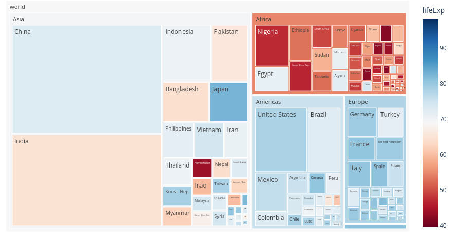
Below is an example TreeMap from the plotly site that show human life expectancy grouped on continent/country, with the area representing total population of the country, and color denoting life expectancy.
Article overview
In this article, I will show you how to create a simple TreeMap with the plotly library using a Pandas DataFrame loaded with hierarchical data.
The dataset will be from a fictional pet store, which sells a variety of animals, grouped as mammals or reptiles.
Create Python3 virtual environment
Ensure you have the latest python3 and python3 virtual environment OS packages.
# make sure python3 venv is installed
sudo apt-get update
sudo apt-get install software-properties-common python3 python3-dev python3-pip python3-venv curl git -y
Then create the Python virtual environment where we will isolate the required modules.
# create directory for test
mkdir plotlytest
cd plotlytest

# create and enter virtual environment
python3 -m venv .
source bin/activate
Install Python modules into virtual environment
The modules and their dependencies need to be downloaded and isolated for use in the virtual environment.
# required modules
pip3 install pandas plotly kaleido
Example to build TreeMap of pet store sales
We will download and run a simple Python script I wrote for this article, ExamplePlotlyTreeMap.py3.
# grab my example script
wget https://raw.githubusercontent.com/fabianlee/ga4-pandas-py3-treemap/main/ExamplePlotlyTreeMap.py3
chmod +x *.py3

# run script
./ExamplePlotlyTreeMap.py3
Hierarchical Data for pet store
Running the script above will output the full DataFrame to the console.
  category  sales  sales_delta    name
0  reptile      1           -2   snake
1  reptile      2            0  lizard
2  reptile      4            5  turtle
3   mammal      8           10     dog
4   mammal      1           -3     cat
The ‘category’ field is the hierarchical parent lineage that allows the TreeMap to group animals together, in this case into either mammals or reptiles.
The ‘sales’ field is how many have been sold this month, and ‘sales_delta’ is how that sales count differs from last month (positive means more than last month, negative means less than last month).
TreeMap visualizations exported
Additionally, the script creates files named “/tmp/petstore-treemap.{png,html}”.
Below is what the static png image will look like. You can open the html file with a browser to view an interactive treemap that has mouse-over values for each cell and click-into details.
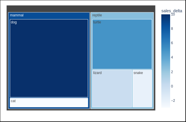
This visualization shows that dogs are very popular in absolute values (large area), while the color show that cats and snakes may need more marketing because they are trending down from last month.
DataFrame creation
The pet store Pandas DataFrame is created as shown below. We hard-coded for simplicity of this example, adding the reptiles first, and then the mammals. But this could just as easily have been from a csv file, or any other data source.
# main DataFrame
df = pd.DataFrame()

# add reptiles to dataframe
df_newrows = pd.DataFrame({"category":["reptile","reptile","reptile"],"sales":[1,2,4],"sales_delta":[-2,0,5],"name":["snake","lizard","turtle"]})
# 'append' is being deprecated, so use pd.concat instead
#df = df.append(dfp,ignore_index=True)
df = pd.concat([df,df_newrows],ignore_index=True)

# add mammals to dataframe
df_newrows = pd.DataFrame({"category":["mammal","mammal"],"sales":[8,1],"sales_delta":[10,-3],"name":["dog","cat"]})
df = pd.concat([df,df_newrows],ignore_index=True)
TreeMap parameters
Then we define the variables to send into the plotly.treemap function.
- Specify ‘df’ as our DataFrame variable
- Use ‘path’ to define the hierarchical data lineage (category > name)
- Use ‘sales’ to Set the area of the data point to mean total sales for the month
- Use ‘sales_delta’ for the color of the area to show if sales are growing or shrinking from the previous month
 # define TreeMap
 fig = px.treemap(
    data_frame=df,
    path=['category','name'],
    labels='name',
    values='sales',
    color='sales_delta',
    color_continuous_scale='blues'
    )
TreeMap export
Finally, we export this TreeMap visualization to our local file system as an html diagram with mouse rollover, and then as a simple PNG image.
fig.write_html("/tmp/petstore-treemap.html")
fig.write_image("/tmp/petstore-treemap.png")
REFERENCES
plotly colorscales – blues, reds, etc.
github fabianlee, example TreeMap for petstore
python3 native virtual environments with venv